Website & BOOKING Platform
Driving Results: 11% of Ticket Sales in 24 Hours Through a Seamless Experience

Intro
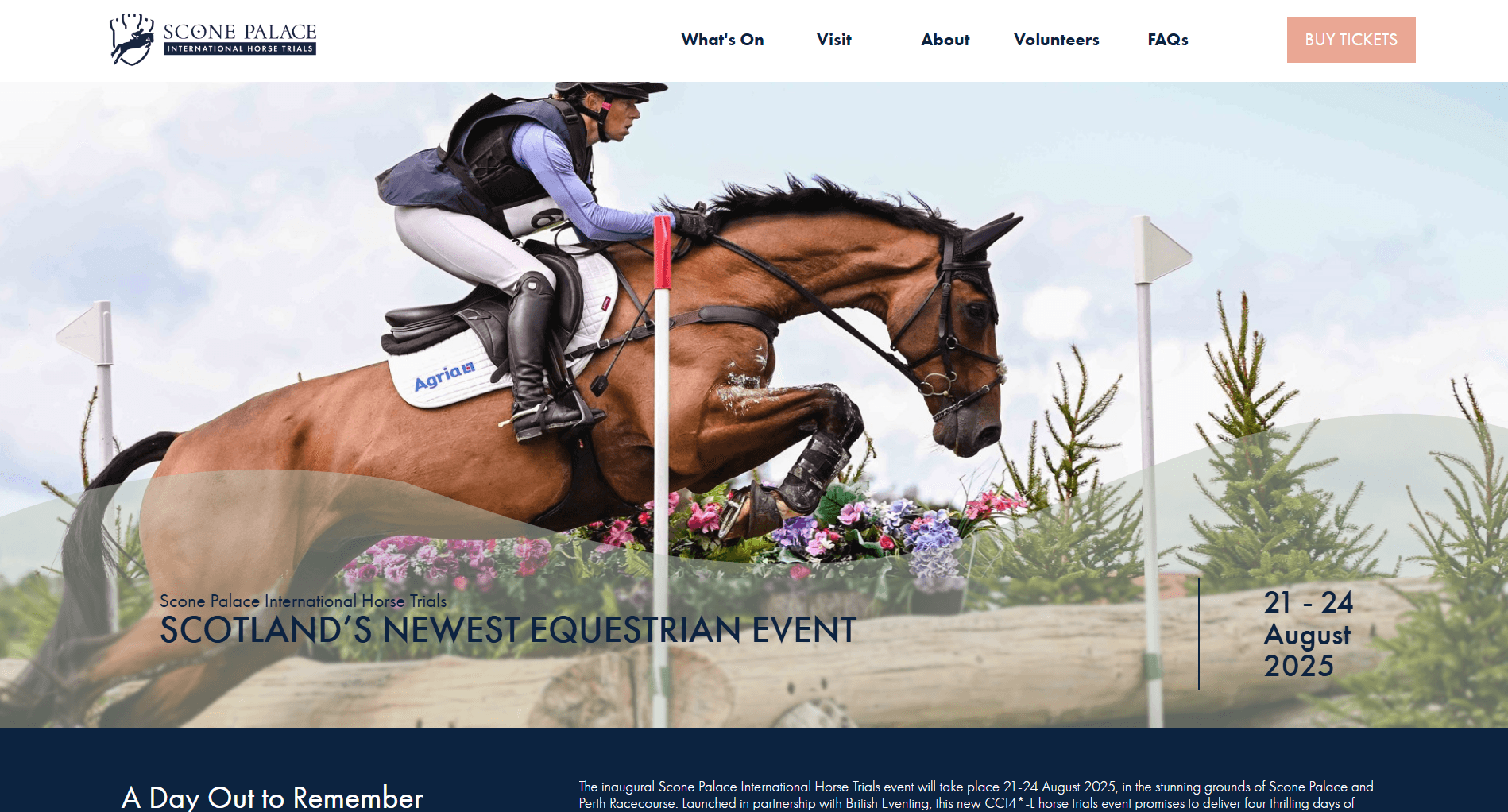
For 35 years, Blair Castle Horse Trials was one of Scotland’s premier events, attracting 60,000 spectators annually and generating significant economic impact. As this era ended, Scone Palace prepared to host the next chapter — taking on the event's legacy with a new international title: the Scone Palace International Horse Trials. Brought in as the UX Designer with expertise in event ticketing, I was tasked with delivering a full digital ecosystem in just 18 days
The Problem
Sky-high expectations: After 35 years of success, the new event had to feel familiar, maintaining the trust and loyalty built over decades through a seamless online experience
Selling tickets with limited details: With the need to launch ticket sales quickly, the challenge was to drive purchases despite incomplete event details, ensuring confidence in the event’s quality.
Building from scratch: There was no existing website, so creating an online presence from the ground up meant not only developing a ticketing platform, exhibitor directory, and CRM system but also establishing a new identity that aligned with the Scone Palace brand.
Constraints
Timeframe
With just 18 days to design and deliver an end-to-end digital experience.
Limited Data
There was no time allocated for extensive UX research for phase 1 and limited analytical data provided by past hosts Blair Horse Trials.
Building in real-time
As the event was still in its early stages, finalising operational details was an ongoing process. This required adapting to evolving schedules and parameters as they were confirmed.
Understanding the Audience
Research & Planning
With no time for deep research, I drew on competitor benchmarks, past event data, and years of experience in ticketing platforms. A day with Blair’s 2024 data confirmed families made up 41% of attendees.
At the event itself, I spoke casually with visitors—many saw it as a social highlight or even a yearly holiday. The shopping aspect kept coming up too, not just as a favourite feature with attendees but driving 27% of the overall revenue.
Three Distinct Users Types
The Loyal Spectator: The established fanbase from Blair, anticipating a seamless transition and access to familiar information like event schedules and ticket sales.
The Competitive Rider: Seeking clear details on event entry, criteria, and schedules.
The Eager Exhibitor: Keen to secure a prime spot in the shopping village.
Phase One |
The Initial Sprint: Building the MVP
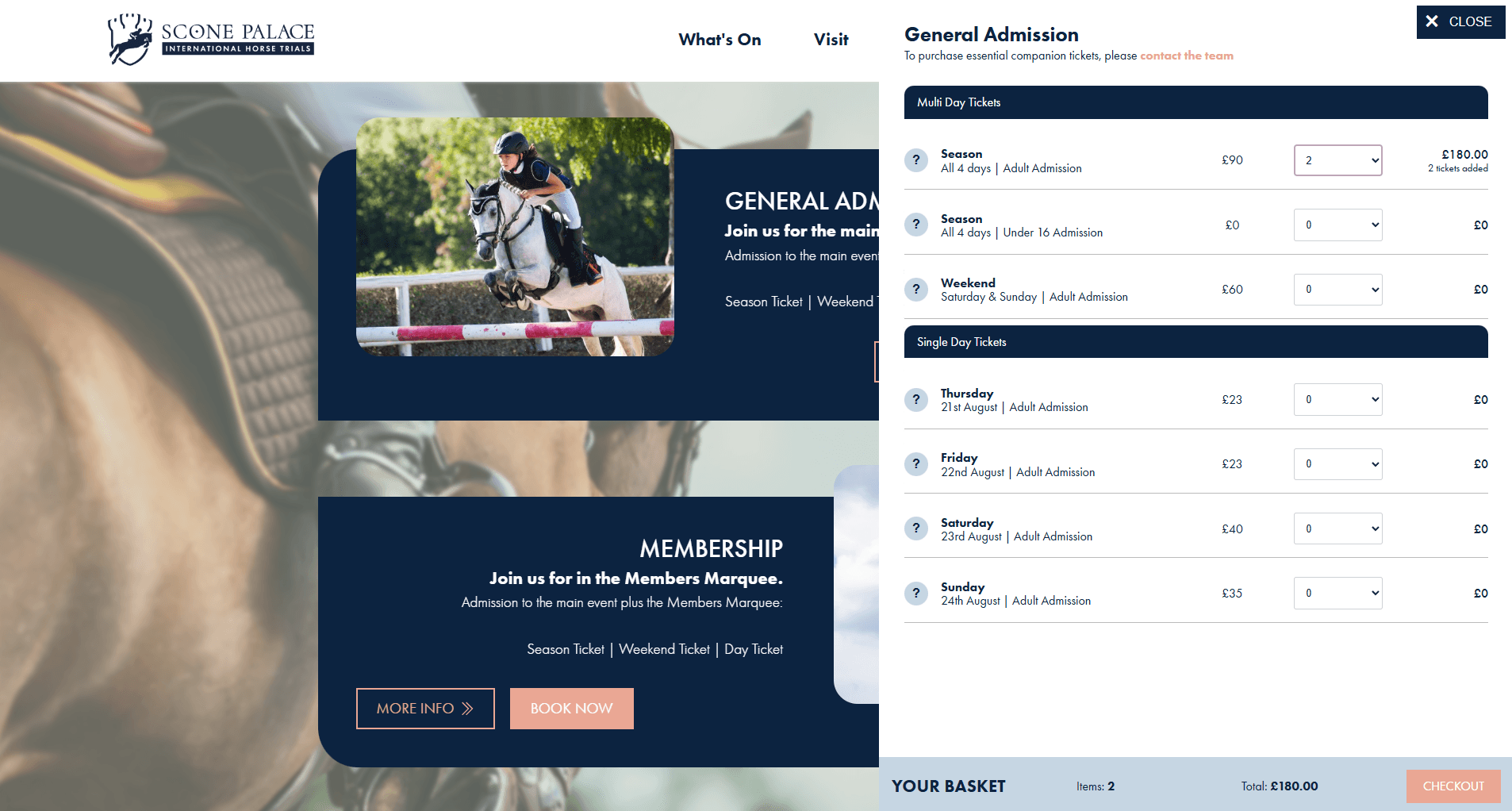
I wireframed the core ticketing flow, starting with a clear “Buy Tickets” call to action that led users to a streamlined landing page—General Entry, Membership (VIP), or Camping. From there, a dynamic side menu let them pick single or multi-day options. Smart logic handled key rules, like requiring an adult ticket before a child one, keeping the experience smooth and frustration-free.
Foundation for Information
A website capable of growing and adapting as event details emerged. This allowed the user to find out key information on tickets and camping facilities before continuing to book.
Ticketing engine built for function
A platform built to handle selling 60,000 tickets from the day of launch, with smart logic to manage complex ticketing rules like adult-child dependencies and add-on restrictions in the booking process.
Camping Criteria
Users could choose between Tent or Motorhome camping, each with set attendee limits. The checkout captured required guest info to comply with Martyn's Law introduced during the project
Upselling
Upselling was a key business goal. I designed a step in the journey for users to easily add extras like course walk tickets, programmes, and flexible guest options for campers.
Early Wins

Emerging Friction
A new challenge emerged. The sales team reported an increase in customer enquiries regarding the complexities of adding dependent tickets like under-16s or course walk. This indicated friction in the user experience, leading to increased administrative overhead as the team manually adjusted orders


Phase Two |
Iteration: Refining the Experience
Recognising that the MVP was just the first stride, we began iteration, driven by user feedback, usability testing and data insights. With a deeper diver into user needs, We conducted competitive benchmarking of other leading equestrian events and weekend festivals to identify best practices.
Usability Under the Microscope
We conducted usability tests with recruited attendees, tasking them with purchasing various ticket combinations and add-ons. This revealed:
Significant pain points in the selection process, people struggled to understand what tickets included, got tripped up by the order of options and wished they had a better sense of the event schedule to guide their choices.
Confusion about purchasing extras without knowing the main ticket requirements.
A Pivot in Approach: Designing for Discovery and Context
The usability testing highlighted a critical insight: users wanted to know when they wanted to attend before deciding what ticket they needed. This led to a fundamental shift in the design approach.
Redesigning the flow
Instead of asking, “What ticket do you want?” we asked:
“What day do you want to attend?”
From the “What’s On” section, users could explore each day’s events, then start their ticket journey from context. From there, we tailored the flow:
Chosen day ➝ Type of experience ➝ Group size ➝ Relevant upsells
Relevant Add-ons
This contextual approach allowed for more intelligent upselling of extras based on the user's specific itinerary, minimizing confusion and irrelevant options.
Proof in the Prototype
This revised approach was brought to life in a high-fidelity prototype and tested again with the same users. The feedback was overwhelmingly positive
"It feels like it took me half the time to purchase tickets compared to last time,"
"it’s actually good to see what else I can add on because I can tell what is part of main event and decide if I want to attend extra activities or not, I feel like I know what I’m buying"


The Impact
Lessons Learned
Bringing Scone Palace International Horse Trials online was all about designing with users at the heart — even with tight timelines and shifting requirements. Through close collaboration and fast, iterative design, we built a digital experience that didn’t just meet the moment, but set the stage for long-term success. From a blank canvas to a fully functional platform with real-time tools, this project proved how UX can simplify complexity and deliver impact.